FREE Film School: How to Use a Dutch Angle
I’m writing a series of FREE Film School posts to give aspiring filmmakers some ideas on how to teach yourself filmmaking. Recently, I’ve talked about shots used by filmmakers, what they are called and how and when they are used. Last week I looked at low and high angles, which are commonly used in filmmaking for cinema and TV.
Some shots are used more commonly than others. The most important thing with every shot usage is to understand the emotion each shot represents. How you shoot your film, combined with how those shots are edited together, will convey a certain mood, feeling, or a moment within the story.
I’ve talked about how Stanley Kubrick deliberately broke the 180 degree rule in a scene in The Shining. He showed a character’s transitional moment within the story, as well as unsettled his audience. Last week, we saw how moving between a high and low angle conveyed transitional character moments, too.
Therefore, while it’s great to understand how individual shots work within a film, it’s also necessary to understand how these shots work together. If we say, “I love that shot in *favourite movie* when *powerful moment happens*” it’s a bit like saying, “I love that note in that song.”
Notes in songs are only powerful and moving when combined with other notes. The same goes for shots in films. A sequence of shots has to work as a whole. This is why we have storyboards and shot lists, so we can construct a harmonious series of shots, which all work together to convey a feeling.
Dutch Angle/Tilt
As I’ve talked about previously, the camera is essentially a human eye which places the audience in the scene. That’s why most of the time we set up our camera to be level with the ground. Humans generally view the world with both eyes at the same angle as the floor they’re standing on.
In this shot the camera tilts left or right so the floor line is at an angle across the screen. This creates an unnatural feeling in the audience. It’s as if we’re all sitting on the Titanic as it heads towards the bottom of the ocean.
Certain filmmakers are famous for using Dutch Angles. Orson Welles liked to use them, for example. Then there is Terry Gilliam, who loves to be creative with camera angles.

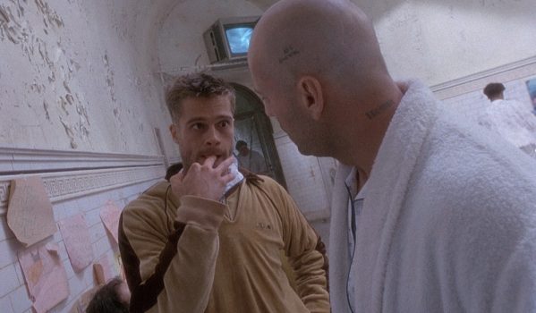
In this scene, Bruce Willis and Brad Pitt are characters incarcerated in a mental health facility. Of course, the subject of madness connects well with unsettling camera angles. Anyone watching this scene will not only be following a story about a time traveller trying to escape an asylum, they will be feeling unsettled because the world is leaning to the left.
This is the same feeling you have when you see a picture hanging on the wall and it’s not level. How many of us have the urge to straighten that picture? And watching a Dutch Angle shot will create the same feeling in us – that we desperately need to straighten things out.
Thriller, Mystery, Horror
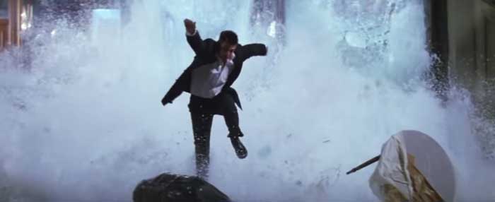
In other words, this shot puts us in the mind of the hero of the film, who is also usually trying to put his or her world in order. See how the Dutch Angle is used in this scene from the film Mission: Impossible (1996) directed by Brian De Palma.
Both characters are sitting at a table. Tom Cruise’s character is receiving information from a character sitting opposite him, which turns his world upside down. During the conversation, Cruise also realises he’s in mortal danger.
Now observe how all the different shots combine to create the feeling and direction of the story. At the start, Dutch Angles are used for both characters. There’s cuts between close up Dutch Angles, but note they tilt opposite ways. Tom tilts to the left, while his enemy tilts to the right.
Is this done to convey the idea that the characters are opponents? Or is it simply an aesthetic choice? Personally, I think it’s both.
Background framing
Something we will talk about in the future: a frame within a frame. This occurs when characters are framed not just by the camera, but also by structures within the scene. In this case, it’s the fish tanks, which not only play a physical role in the scene but also have a symbolic meaning.
Notice how Cruise’s opponent’s head is framed by a shark tank above his head, with the sharks swimming about ominously. The shot says “this guy is a shark and he’s gonna eat you”. At the same time, Cruise’s head is also partly framed by a water tank, but there’s nothing in it. So, this subtle difference in background indicates the difference between the characters, too.
Notice also, water plays a major role later in the scene. Therefore, this background has a very important role in letting the audience know about the water. When the big moment happens later, the audience are well prepared.
Dutch Angles + Discordance = Tension
Observe how the Dutch Angles at the start combine with the discordant music (by Danny Elfman) to create a very intense feeling. Cruise’s character is in deep shit and he knows it… and he’s panicking. But then he starts to pull himself together.
As Cruise’s character starts to work out a plan, the shot changes to a level shot. In other words, the regular shot conveys a sense of stability and clear headedness. As the hero starts to turn things around using some quick thinking, this editing choice reflects this change in mood.
But the scene still cuts back to the Dutch Angle of Cruise, because he’s not out of danger yet. But see how the edit begins to mix the stress-inducing Dutch Angle with more comforting level shots. As a combination of notes in a song creates a mood, so does a combination of shots in a scene.
Another thing to note is how the Dutch Angle is used more on Cruise than it is on his opponent. We can be sure the editor of this film (Paul Hirsch) had Dutch Angle options for both characters for the entire scene. But he chose to use it more on Cruise, because Cruise’s character is the one suffering the stress of the situation. Not only that but he’s also the hero, the character the filmmakers hope the audience care about most. Therefore, it’s important to focus more on the feelings of the hero over other characters.
Tension Builds
As the tension builds, the sequence returns to cutting between Dutch Angles for both characters. Cruise’s character is about to make his move. The discordant music rises in tension, as the cuts becomes quicker and Cruise’s opponent gets angry. Mixed in with these angles is a close up insert of Cruise’s hand as he prepares to throw some explosives, which he’s hiding out of sight.
So everything builds – the actors’ performances, the music, the shots, the editing – towards the big moment. The explosives are thrown, shattering the side of the fish tank. The scene is flooded with water – water that was put in our minds throughout the scene as it was in the background of every shot.
As Tom makes his dramatic getaway, the music becomes harmonious and victorious, celebrating the hero’s victory. The Dutch Angles are gone as the level shot reflects the new mood at the end of the scene. The situation is recovered, the world is back in order (at least for now), the picture on the wall is straightened.

Eager to learn more?
Join our weekly newsletter featuring inspiring stories, no-budget filmmaking tips and comprehensive equipment reviews to help you turn your film projects into reality!
Simon Horrocks
Simon Horrocks is a screenwriter & filmmaker. His debut feature THIRD CONTACT was shot on a consumer camcorder and premiered at the BFI IMAX in 2013. His shot-on-smartphones sci-fi series SILENT EYE featured on Amazon Prime. He now runs a popular Patreon page which offers online courses for beginners, customised tips and more: www.patreon.com/SilentEye

