How to Shoot a Commercial iPhone Video
Today I’m going to look at this short film, a portrait of Elise Lepinteur, protégée of Christophe Adam worldwide famous pastry chef. The film was entirely shot in Paris with an iPhone X.
The video currently has over 296,000 views, so it’s a great advert for the producers AmnesiArt. But how was it made? Can we all do this with our smartphones?
Unlike the previous YouTube hit video we looked at, Made in Paris has a much more formal, traditional style. Something that might be more appealing if you are working for clients who want something polished.
First, the music
The track used is “It’s a New World” by Tristan Barton and was licensed through Premiumbeat.com.
You can see they have used the full track, which is 3 minutes and 15 seconds long. In other words, when editing, the length of the music decided the length of the film. Because certainly the music was written before the film was shot. The music will have cost them $65 for a standard license.
This is actually a great way to structure your video. They obviously chose the music for it’s light, positive and upbeat style and the way it reaches an emotional crescendo near the end. They also decided the tempo of the music would fit the tempo of the editing they wanted to achieve.
Preferably, when you edit to music, you will try to time the cuts from shot to shot with the beats of the music. You don’t have to be exact every shot, but the more the visuals are in time with the music, the more the film feels like an “integrated whole”. The visuals will appear to tick along to the pace of the music.
Equipment used
- Marsace MT-01 Robust Table Desktop Tripod
- MeFOTO SideKick Mobile Phone Holder
- Gitzo GM2562T Series 2 6 Sections Carbon Traveler Monopod
- Manfrotto Lightweight Fluid Video Head with Flat Base
- DJI Osmo Mobile Phone Stabilizer
- Zhiyun Smooth-4
- Yongnuo YN300 Air Pro LED Video Light
- Anker Astro E1 5200mAh Portable Charger
- Anker PowerCore 10000
- Lavalier Microphone, Rode
- Rode NTG-3
- Zoom H4n
Opening
The film starts with the first notes of the music – bright and staccato (in orchestral music, the string section makes this “pizzicato” sound by plucking the strings rather than bowing). The AmnesiArt logo animation is on screen for less than 3 seconds. Fade to the opening shot…
The opening shot is very important, because it sets the tone for the rest of the film. You also might want some impact here to grab your audience’s attention right from the beginning.
In this opening shot, the camera pulls back from a masterpiece of pastry art, gazed at by the subject of the documentary, Elise Lepinteur (presumably the creator). The shot is allowed to last a little longer than other shots in the film, because the editor is setting the scene and because of the importance of the first shot.
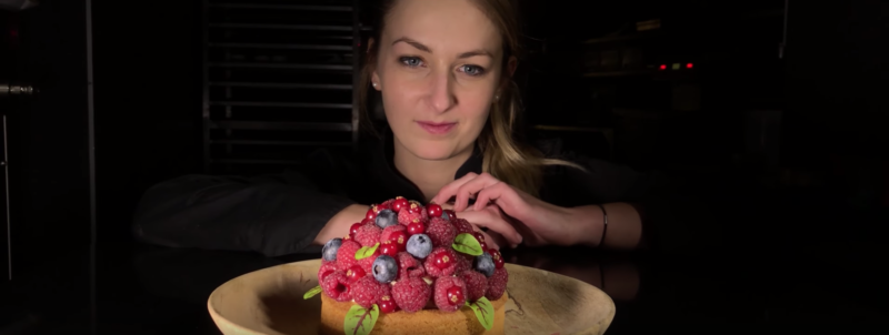
Straightaway, we can see they have decided to use a widescreen ratio. However, there is no mention of using a wide angle lens or anamorphic adapter. So it could be a case of simply cropping the image to create a widescreen look.
The next shot uses a creative, dramatic angle – the kind of angle it is easier to get with a smartphone than a regular camera.
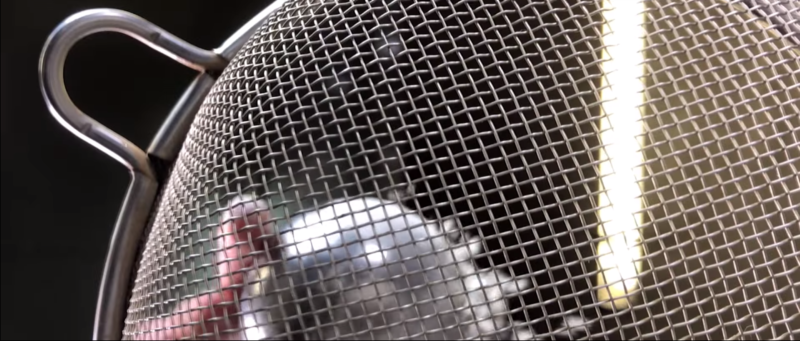
The sieve moves dramatically into focus, very close up and some flower is sprinkled down on the viewer from above. Now you know what it feels like to be a mixing bowl awaiting ingredients. They have used some slow motion, which increases the drama (and also slows the shot down to make the movement of the sieve work better).
The strip lights in the background give the shot more depth and add extra drama. The shot lasts quite a few seconds, before fading to the next shot. As we’re still in the opening, the editing is deliberately bringing us in slowly, before picking up the pace later.
Then we’re inside an industrial oven. The camera is rotating (or did they do that with editing software?). The important thing is, it’s not just a still frame shot. However, the shot only lasts a couple of seconds before we cut to an ordinary still framed shot of Elise removing the pastries from the oven.
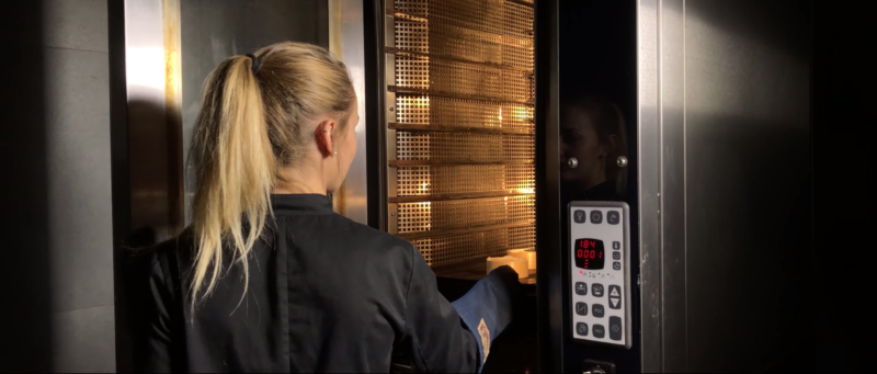
Elise introduces herself in the next shot, talking to camera. But notice the audio overlaps onto this shot. Why do that?
One reason is that it helps to create momentum in the film. As the audience, we’ve started to think about the next shot before it’s arrived. We’ve been given a clue, but not the whole thing. Now the cut to the next shot sits “underneath” this audio. By having voice audio cross over the cut point, it helps ties together different shots.
If they had cut and then Elise started talking, that would separate out the 2 shots in our minds – putting more of a gap between them. But you can tell from the way they have constructed this video, they want elements to overlap and be interwoven together.
In general, it makes the film feel more like a “whole”, an integrated work. Without overlapping elements, the film would feel more disjointed – a collection of shots loosely assembled, one after the other. Cross-fading shots has a similar effect.
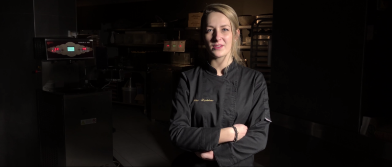
You can see how with smartphone video there is much less detail in the shadows, which makes this shot look a bit surreal, with industrial cooking equipment lurking in the dark behind her.
Made in Paris
Elise continues to talk to us over some shots of Paris. Does it look romantic? You bet.
The first shot is a rising shot, as Elise rides her scooter along the street towards us. It’s taken during either sunrise or sunset. This is a great time to shoot exteriors, as the sunlight will not be too harsh.
Next shot is stationary, but with 2 boats moving away from us along the River Seine towards a beautiful sunset (or rise). This moving towards (scooter) followed by a moving away (the boats) gives a rhythmic pulse to the film. If both shots had objects moving in the same direction, it wouldn’t have felt as nice to watch. Towards and then away is more hypnotic and relaxing.
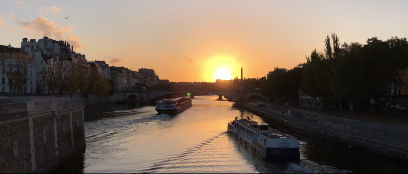
Another Paris shot, this time tracking Elise as she walks beside the river in daylight, is followed by a product shot.
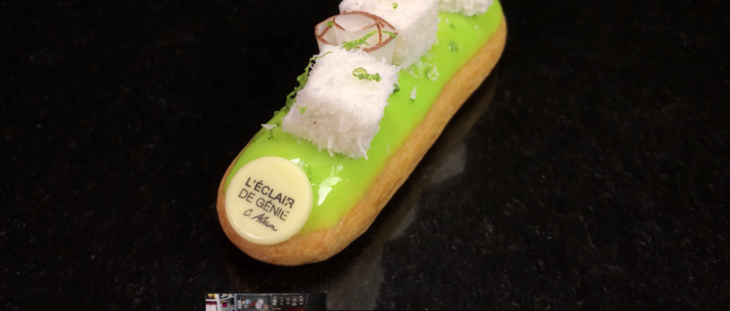
The camera moves slow in on the tasty looking pastry, which has been set up with some lighting to make it look as polished as possible.
The constant movement in the shots complements each other, being generally at the same pace. Imagine a pendulum keeping time, swinging left and right. Well, in film you can use a similar idea, except the camera can move (or objects move within the frame) in a variety of directions.
The middle
That product shot indicates the start of middle section. The next shot is quite ugly but it’s there to presumably show the company logo on her chef’s outfit. It also begins the demonstration of how Elise makes one of these pastries.
We now get a series of motionless shots, cooking show style, to illustrate the making of pastry products. Meanwhile, Elise continues to talk us through what they are about. There’s a nice use of slow-mo in one shot too and some extreme close ups. Notice how the shots are mostly short. 3 or 4 seconds long.
To indicate the end of that sequence, the final shot fades to black.
To start the next sequence, the camera follows a pan to a food mixer. After that, we have some “circular shots”. First the food mixing in the mixer bowl. Cut to an overhead shot as icing is applied to a spinning cake on a wheel.
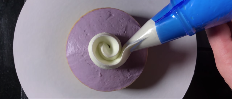
See how those 2 shots fit together because of the circular motion in both?
Next, the camera is pulling away as the finishing touches are applied to the circular cake. Then, (using that backward-forward motion again) the camera moves in as Elise cuts the cake neatly to display it’s goodness. To finish the sequence, there are 2 extreme close ups, combining with Elise saying the words “colours and textures”.
Again, image, words and music combine to create a sense of wholeness. This is not just random shots of someone making cakes slapped together. These are carefully crafted moments.
Midway point
To transition into the next “act” of the movie, there are 3 moving forward shots. First is in a park with the camera on the ground, with Elise walking away from camera. Again, easier to get this shot with a smartphone – simply place it on the ground with that mini tripod.
Then there’s a shot from the bridge again, looking out at a beautiful city landscape, the camera moving forward slowly. They use a foreground object to create a sense of depth in the image and a greater sense of moving forward.
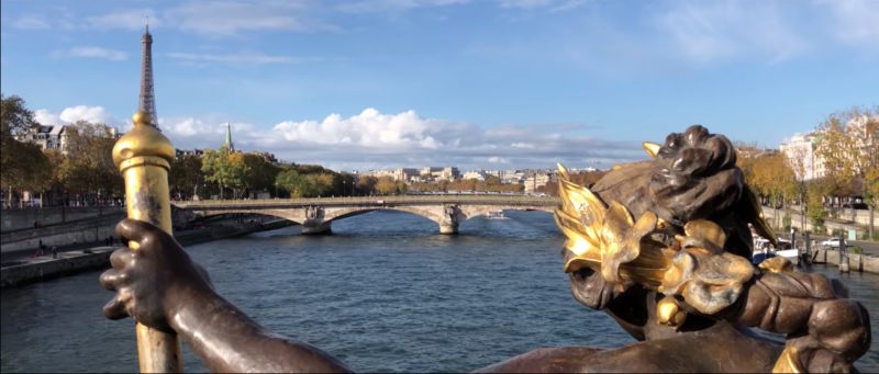
It’s a very smooth movement, so I wonder if they achieved that with the gimbal, or added extra stabilization after. This shot then cuts nicely to the next shot, which is also moving forward through a Paris food market.
Elise walks into the frame of this market shot, which prepares us for the next shot, where she enters frame of the still shot of the food stalls.
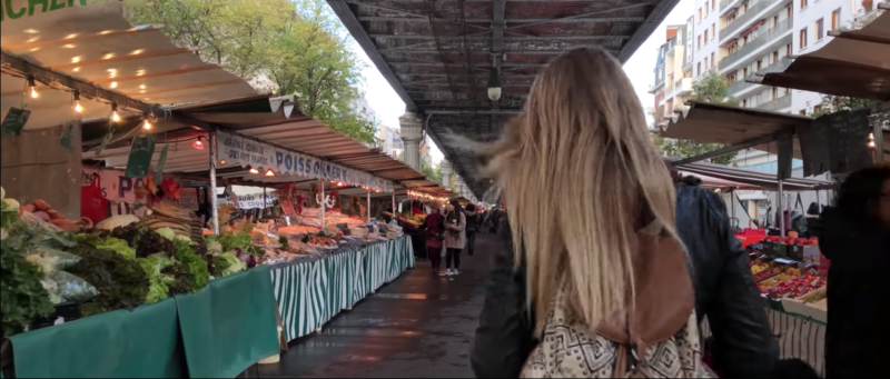
See how Elise entering this shot above prepares us for her entering this shot below.
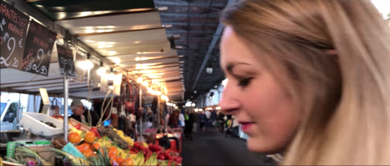
Also notice how the focus is set for her appearance in the frame, before she appears. In the still above there is motion blur from her movement, but once she stops she is in focus (as her voice over continues).
The following shot, shows us a Point of View Shot (POV) of the fruit. As if the camera is Elise’s eyes, looking at the box of berries. This is a very powerful, mind-bending shot, as it basically puts us into Elise’s mind for a couple of seconds. We see what she sees.
Now that’s we’ve seen how dedicated Elise is to her job, and briefly experienced what it looks like to be in her mind, there’s a shot of the front of her work building, with the company name and logo displayed for us. Even though the shot is still, Elise walks through the shot to add movement (as well as keep us connected with Elise and show us Elise and her work connected).
By having Elise do the narration (even though she has a strong French accent), and showing her in her story as she narrates it, the video is far more personal and intimate than if it was just a collection of shots of the company and anonymous workers making pastries.
The movement of Elise in this shot is followed by the upwards movement of the camera in the next shot.
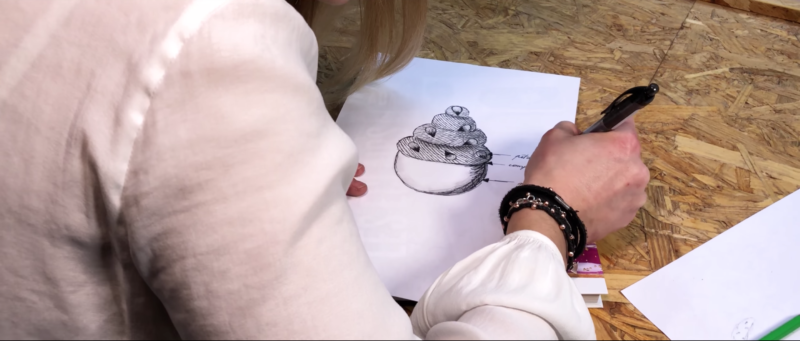
This time we are not in Elise’s mind, we are peeking over her shoulder, catching a rare glimpse of the genius at work.
Next is a fun shot with the iPhone placed inside a fridge. Again, using the smartphone to their advantage. How easy is it to stick your smartphone in the fridge, compared to other types of camera?
The door is opened and Elise kneels into shot. Elise’s movement, plus the reveal of her face, makes this shot even more interesting for the audience.
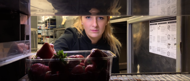
But think about the amount of information being revealed in this shot. They’re also showing the care that’s taken over the food and the how fresh the food is.
Following this shot is the classic food shot – flat overhead. The flat overhead shot (minimal angle) is one of the most attractive ways to display food in photography and video. Hence, it’s constant and continued use when people Instagram their lunch.
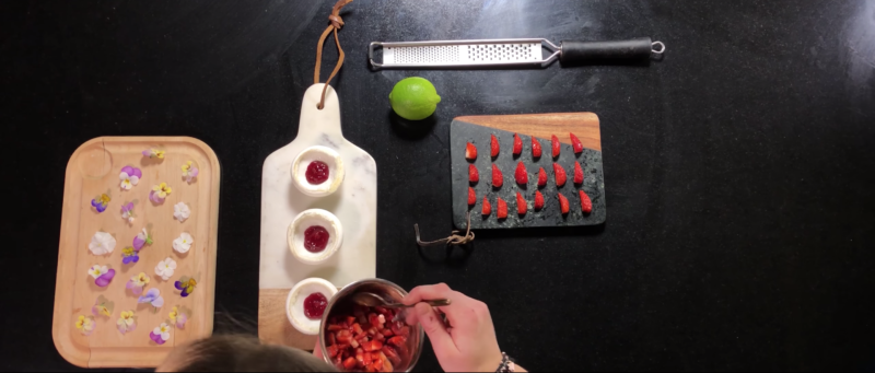
There follows a series of rapid, well lit and exposed close up shots depicting the making of the attractive-looking pastry. The sequence is punctuated by an old still photo of Elise and her mentor, Christophe Adam. But even the still frame has movement, as they animate a pan across the photo.
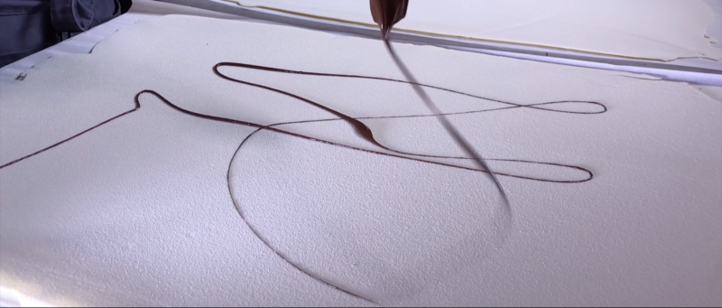
This adds depth and history to the film’s narrative. It’s kinda touching as well. The film lingers on this shot for a moment before cutting to a slow motion shot of chocolate sauce being “written” onto the white surface of the pastry.
Another flat overhead…
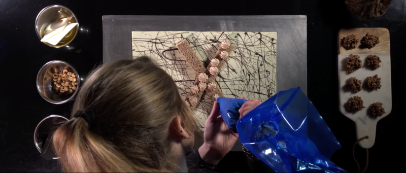
Note, with these still camera shots, there’s always movement within the frame. In the next shot, the camera is in the same position but rotating, as Elise continues her work below. This camera moment means the shot avoids getting boring by repetition.
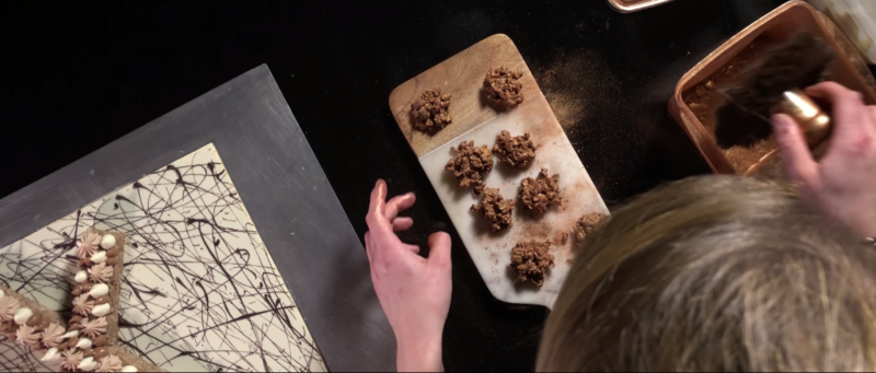
How would might you achieve that rotation? One option is to shoot at a higher resolution than you edit. As the footage will be bigger than the frame, this gives you the option to animate the footage in the editing process.
The next shot is timed with a big cymbal crash in the music as the camera pulls back from the final masterpiece, whilst Elise applies the finishing touch.
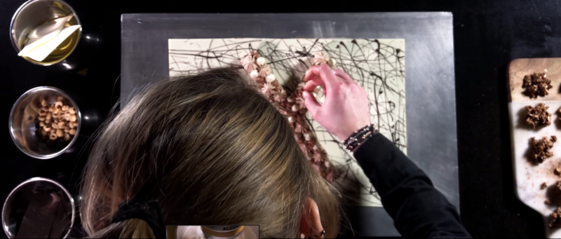
The End
This shot and cymbal crash indicates we’re into the final section of the film. We have another series of close up food shots and “making of” shots before we arrive back where we started – the shot of Elise standing surrounded by some food making equipment in deep shadow.
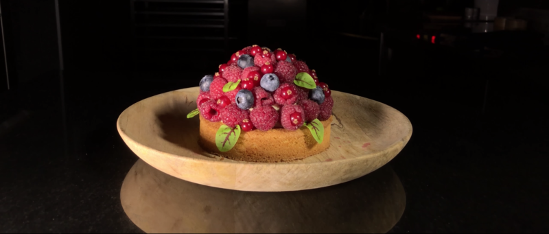
The final shot is of the pastry we saw at the beginning – only this time we feel we know a lot more about that pastry than when we started watching.
Because they used the music in its entirety, they were able to use the structure of the music to structure the edit of the film. Lifting where the music lifts, a dramatic reveal coincides with the big cymbal, the end section images bring us out of the film as the music comes to rest… and so on.
Eager to learn more?
Join our weekly newsletter featuring inspiring stories, no-budget filmmaking tips and comprehensive equipment reviews to help you turn your film projects into reality!
As an Amazon Associate I earn from qualifying purchases.
Simon Horrocks
Simon Horrocks is a screenwriter & filmmaker. His debut feature THIRD CONTACT was shot on a consumer camcorder and premiered at the BFI IMAX in 2013. His shot-on-smartphones sci-fi series SILENT EYE featured on Amazon Prime. He now runs a popular Patreon page which offers online courses for beginners, customised tips and more: www.patreon.com/SilentEye


Great shot breakdown. Those closeup product shots… They must have used a macro or tele lens, oui?
Thanks! Yes, I’m guessing so. Although they haven’t listed lenses amongst their equipment…