7 Steps: Framing and Composition for Beginners
I always say creativity is about asking yourself questions. So in this video I’m going to give you 7 questions to ask yourself when framing and composing a shot.
If you are new to shooting video on your smartphone, these steps will help you add meaning and power to your shots. It doesn’t matter what camera you have, the power of the shot comes from the creator. And adding a methodical thought process to your workflow will enable you to unlock the power of your own creativity.
1. What or who is your subject?
This might sound obvious, but the biggest difference between serious and hobby-level cinematography is the subject. In fact, the amateur video I see frequently has no subject at all.
Often, tourists visiting a beauty spot will pull out their smartphone, hit record and shoot a nice pan shot. So what is the subject of this pan shot? Well, the answer is – everything.
That’s because, before we start taking our video-shooting seriously, we don’t really think about our video having a subject. We just film everything, from left to right.
But what are we telling the audience with this kind of shot? Not much. I think we just want to say, “I was here”. But this kind of shot is very unfocused. I don’t mean the picture is not in focus, I mean our minds are not focused on what we want to say with the shot.
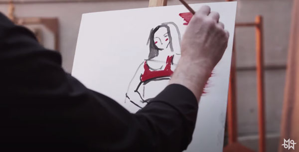
That’s not to say there isn’t a place for a slow pan of the entire view, once in a while. This kind of shot is good for setting the scene. For telling the audience – this is where we are.
However, your video will be more engaging if the majority of your shots have a subject. So, before you frame a shot, you need to ask yourself – what (or who) is the subject?
If you consider yourself a beginner, just by following this 1st step alone you will improve your videography skills massively. You’ll take your shots from unfocused and wishy washy to focused and powerful.
What you show to your audience dictates how your audience feels. Therefore, an unfocused shot with no subject will leave your audience feeling unfocused. In other words, they’ll be paying less attention to your video. Like your wandering pan shot, your audiences’ minds will be wandering too…
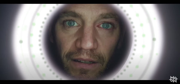
Hey, I’m talking to you. So please don’t get distracted.
I was just saying that a focused shot will focus the minds of your audience.
“Ah”, they will think unconsciously, “this video maker has something to show me. I better pay attention.”
2. What shape is your frame?
Like with paintings or photographs, a frame can be any shape we want. Usually, either a square or a rectangle of some kind. Pretty much since the camera was invented, photographers have turned the camera from portrait to landscape, depending on what they were shooting.
As the name of these frames suggest, landscape is used for landscapes by photographers and portrait is used for portraits. Of course, they are used for other subjects too. But, I say photographers because until recently cinematographers have only used the landscape frame shape.
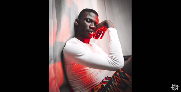
Which is why conventional opinion tells us that, unlike photographers, cinematographers must limit themselves to holding the camera horizontally. Perhaps because this is the normal way for human beings to experience the world. But that ignores the fact that professional photographers have been showing us the world in portrait mode for over 100 years and nobody has complained.
16×9 has become the standard aspect ratio for most videos (nearly always horizontal). Now that we consume video via computers, laptops, TVs and smartphones, 16×9 suits most of those devices pretty well. It’s wide enough to look a little cinematic, while not so wide we lose a big portion of the screen to black bars.
And this is especially important now that so many people consume video via their small smartphone screens. Having said all that, this is a creative choice. Practical issues aside, how do you want your video to be seen? What works best for the story?
3. Where to place your subject?
Now that you’ve decided what the subject is and the shape of the frame, you can ask yourself where in the frame you want to place the subject. Bear in mind, the shape of the frame – otherwise known as aspect ratio – dictates how you compose the objects within the frame.
A wider screen starts to create different areas of the screen. A centred subject might be harder to get right and feel clumsy. While a subject on the left or right, leaves a large area unoccupied.
Theory
There’s a few theories to help you think about where the subject should be in the frame. Ideas such as the Rule of Thirds and the Golden Ratio.
These theories were invented to impress people at dinner parties and to persuade yourself you know what you’re talking about. For example, if someone starts to bore everyone with their opinion on Tarkovsky or Rembrandt you can easily shut them up if you have a more nuanced understanding of the Golden Ratio than they do.
However, let’s simplify things because I’d rather get you out shooting video than sitting indoors reading textbooks. So just ask yourself this sub-question: do you want the subject in the middle or at the side of the frame?
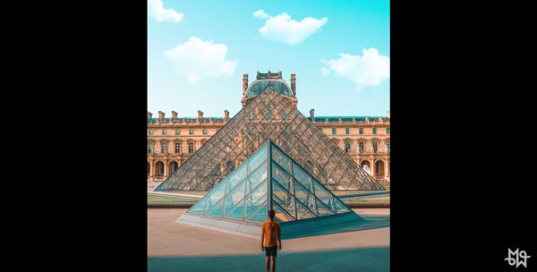
Placing your subject in the centre of the frame really says to your audience “look at this” in an unambiguous way. A centred subject becomes much more important. Indeed, it (or they) will totally dominate the frame. Not only are you saying “look at this” you’re also saying “don’t look at anything else” and therefore the rest of the frame becomes background decoration.
However, putting your subject towards the side of the frame invites your audience to consider the other things within the frame. The further you push your subject towards the edge, the more you invite your audience to consider the content of the background.
Why would we do that?
Because it tells a different story. For example, it might put us in the mind of the subject. Take the classic shot of someone surveying the view from a high point.
Put the subject in the middle of the frame and we think more about them and less about the view. Put them to the side, and now we feel like we’re seeing the view as the subject sees the view. Especially, if the subject is looking across the frame. We follow their gaze to the spectacular view and feel like we know what they’re feeling.

Placing the subject in the middle of the frame can make it (or she or he) appear more powerful, more ominous, blocking the path forward, or more dangerous.
For example, imagine a soldier as the subject of a frame. Placing them in the middle says, “this soldier is not going to let you pass. This soldier is dangerous, aggressive and an obstacle”.
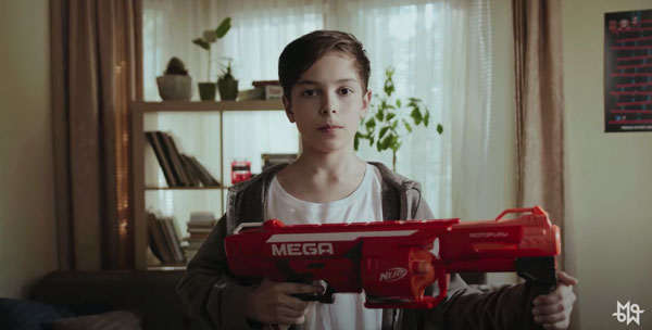
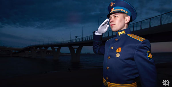
Now, place the soldier to the side and they seem less dangerous, less imposing. And if the soldier is looking across the frame, they’re inviting you to pass on your way to whatever is in the background.
4. What do you want to do with the background?
Listen, when I make fun of the Rule of Thirds and Golden Ratio, I’m not advising you to break rules. Just saying, the problem is that rules can create a kind of creative blindness.
And I speak as someone who suffered from that kind of blindness before rediscovering my creative mojo.
So, OK switch on your Rule of Thirds grid and line up the subject. Now, what’re you looking at? Your subject and a grid. But are you still thinking about the background?
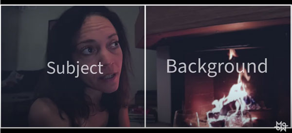
With a DSLR and a long lens, we can blur out the background and it becomes like wallpaper.
But when we’re shooting with a smartphone, the background is more important because everything is more in focus. So we need to think more about how the background works in relation to the subject.
A composition is created within the frame depending on where the camera is in relation to the subject and the background.
So move the camera – ie you and your smartphone – until it looks good.
An obvious example is when taking a picture of someone and a tree or plant appears to be growing out of their head. Until you take a few steps to the side and now the framing looks so much better.
Does your subject disappear into the background? If the subject is similar in colour and tone to what’s behind, then the subject is less distinct. If there’s contrast, however, the subject stands out.
5. Do you want depth in your image?
The background can create depth, especially if you have something creating perspective lines – lines moving into the distance. Like a hallway, an alleyway or a line of trees, for example.
Sometimes we want depth in the image, sometimes we want a flat background.
If the subject is to the side of the frame, we might want to look for depth in the background. But if we have the subject in the centre of the frame, perhaps we would prefer a flat background.
Adding depth can be quite dramatic. Perspective lines add depth. But they also draw our attention toward the point where the lines converge.
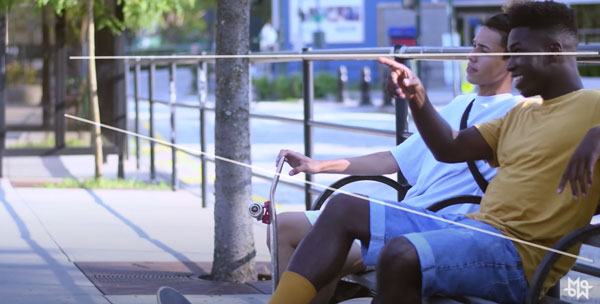
Is this what you want? Or do you want to keep your audience focused on the foreground and the subject?
How about a long table? If you sit your subject at the end of the table, the perspective lines direct the audience’s attention towards them in a very dramatic way.
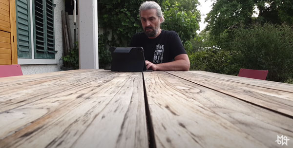
How about this same shot but with the camera moving slowly forwards, towards the subject? Or pulling slowly back?
Pushing in or pulling back? What difference does it make?
Pushing in moves closer to the subject, which usually gives the audience a more intense feeling. So, if the scene is growing in intensity, you might push in along the table during the scene to increase the tension.
On the other hand, pulling back reveals the background. So we start intense and then reveal where the subject is sitting. So this might work well if this is the first time we see this character in this location. Perhaps as a way to reveal how important they are.
6. How natural do you want the composition?
Remember that people are used to seeing things in a certain way. If you give them something similar to what they’re used to, they’ll feel comfortable and relaxed, but they might fall asleep.
On the other hand, if your composition contrasts with how we are used to seeing the world, we feel less comfortable but more awake. We’re more likely to be excited by the image.
For example, getting close to the subject. The closer we get, the more intense the feeling for the audience. And if the subject is human, the closer we get, the more intimate the shot feels.
Do you like symmetry?
Is it right for your story, your message, or whatever you want to say with your video?
Place the subject in the middle of the frame and then have them in front of a symmetrical background. This really pushes our attention into the centre of the image. It also feels really balanced and deliberate. It makes us aware that the cinematographer is making a statement. It’s self-conscious, stylised, unnaturally perfect.
Tip the camera at an angle – what we call a Dutch angle – and it creates an uneasy sensation in the viewer. Keep the camera level and everything feels more comfortable. But maybe too comfortable.
It depends what you’re trying to say with the shot, the scene, the sequence and the video as a whole.
7. How does the framing change?
The last question to ask yourself concerns how (or if) the camera moves during the shot. Quite often, the camera won’t move at all. Perhaps we’ll mount the smartphone on a tripod.
Framing is of course much simpler when the camera doesn’t move. But one of the big advantages of smartphones is how mobile they are. So this gives us incredible flexibility when it comes to camera movement.
Once more, it’s all about what you want to say and how you want the audience to feel.
If it’s used well, I really enjoy a completely still frame. The British director Joanna Hogg takes this to the extreme in her films, completely avoiding close ups and camera movement. Instead, opting for long, still wide shots for complete scenes, which makes us feel like detached voyeurs.
It’s quite risky. And that’s why she would be considered an arthouse director. But isn’t it refreshing to see directors try something different?
If you are an aspiring filmmaker, you should try arthouse films which experiment with the medium. Because even if you don’t like the film, the experiment will teach you a ton about the effect of framing and composition.
If you watch a Joanna Hogg film, thinking about how the cinematography makes you feel will help you understand how your own shots will make your audience feel. And when you shoot a close up you’ll do so in the knowledge you want to give an experience to your audience not provided by Joanna Hogg films.
Watch Archipelago by Joanna Hogg
But, as I say, smartphones definitely make moving the camera easier.
Let’s say your shot starts at the bottom of a tall building. Then the camera tilts upwards and ends looking up, with the perspective lines drawing us to the sky above. How will that make your audience feel?
Small. And impressed by the size of the building. Why would we want to do that?
Perhaps you just followed a character as they entered the building and you want to reveal to the audience how huge the building is. This might suggest that the character is facing an imposing force and is about to encounter that force in the next scene.
Or if you are shooting a video about a city with tall buildings, you might choose to shoot a series of shots looking upwards to create a theme. So each shot would carry a similar message and therefore the video as a whole would be more powerful.
A Creative thought process
This is a creative thought process you can go through to work out the framing of your shot. It might seem very complicated and time consuming. But as you practice this process more and more, it will get quicker.
As with anything, the more experience you get, the more instinctive it becomes.
So ask yourself these 7 questions.
- What or who is your subject?
- What shape is your frame?
- Where to place your subject?
- What do you want to do with the background?
- Do you want depth in your image?
- How natural do you want the composition?
- How does the framing change?
Eager to learn more?
Join our weekly newsletter featuring inspiring stories, no-budget filmmaking tips and comprehensive equipment reviews to help you turn your film projects into reality!
Simon Horrocks
Simon Horrocks is a screenwriter & filmmaker. His debut feature THIRD CONTACT was shot on a consumer camcorder and premiered at the BFI IMAX in 2013. His shot-on-smartphones sci-fi series SILENT EYE featured on Amazon Prime. He now runs a popular Patreon page which offers online courses for beginners, customised tips and more: www.patreon.com/SilentEye


Hey so useful thank you so much for the page